animation-fill-mode
版本:CSS3
CSS 属性 animation-fill-mode 设置 CSS 动画在执行之前和之后如何将样式应用于其目标。
示例
/* single animation */
animation-fill-mode: none;
animation-fill-mode: forwards;
animation-fill-mode: backwards;
animation-fill-mode: both;

/* multiple animations */
animation-fill-mode: none, backwards;
animation-fill-mode: both, forwards, none;
浏览器支持
 |  |  |  |  |
IE10以上版本的浏览器都支持animation-fill-mode | ||||
语法
animation-fill-mode :none| forwards| backwards| both
取值
- none:当动画未执行时,动画将不会将任何样式应用于目标,而是已经赋予给该元素的 CSS 规则来显示该元素。这是默认值。
- forwards:目标将保留由执行期间遇到的最后一个关键帧计算值。最后一个关键帧取决于
animation-direction和animation-iteration-count的值:animation-directionanimation-iteration-countlast keyframe encountered normaleven or odd 100%ortoreverseeven or odd 0%orfromalternateeven 0%orfromalternateodd 100%ortoalternate-reverseeven 100%ortoalternate-reverseodd 0%orfrom - backwards:动画将在应用于目标时立即应用第一个关键帧中定义的值,并在
animation-delay期间保留此值。第一个关键帧取决于animation-direction的值:animation-directionfirst relevant keyframe normaloralternate0%orfromreverseoralternate-reverse100%orto - both:动画将遵循
forwards和backwards的规则,从而在两个方向上扩展动画属性。
| 默认值 | none |
| 适用于 | 所有元素,包含伪对象::beforeand::after |
| 继承性 | 无 |
| 动画性 | 否 |
| 计算值 | 指定值 |
| 媒体 | 视觉< |
实例
//HTML

<p>move your mouse over the gray box!</p>
<div class="demo">
 <div class="growsandstays">this grows and stays big.</div>
  <div class="grows">this just grows.</div>
</div>

//CSS

.demo {
  border-top: 100px solid #ccc;
  height: 300px;
}

@keyframes grow {
  0% { font-size: 0; }
  100% { font-size: 40px; }
}

.demo:
hover .grows {
  animation-name: grow;
  animation-duration: 3s;
}

.demo:
hover .growsandstays {
  animation-name: grow;
  animation-duration: 3s;
  animation-fill-mode: forwards;
}
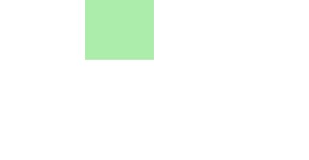
<style type="text/css">
div{
	width:100px;
	height:100px;
	position:relative;
	background-color:hsl(120,65%,75%);
	animation:demo 5s infinite;
	-webkit-animation:demo 5s;
	animation-fill-mode:forwards;
	-webkit-animation-fill-mode:forwards;/*safari和chrome*/
	}
@keyframes demo
{
	from{left:0px;}
	to{left:350px;opacity:0.5;}
}
/*safari和chrome*/
@-webkit-keyframes demo
{
	from{left:0px;}
	to{left:350px;opacity:0.5;}
}
</style>
</head>
<body>
	<div></div>
</body>
效果图: