perspective
版本:CSS3
CSS 属性 perspective指定了观察者与 z=0 平面的距离,使具有三维位置变换的元素产生透视效果。 z>0 的三维元素比正常大,而 z<0 时则比正常小,大小程度由该属性的值决定。
示例
/* Keyword value */ perspective: none; /*values */ perspective: 20px; perspective: 3.5em; /* Global values */ perspective: inherit; perspective: initial; perspective: unset;
浏览器支持
 |  |  |  |  |
IE10以上版本的浏览器都支持perspective | ||||
语法
perspective :none|<length>
取值
- none:没有应用 perspective 样式时的默认值。
- <length>:指定观察者距离 z=0 平面的距离,为元素及其内容应用透视变换。当值为0或负值时,无透视变换。
说明:
指定观察者与「z=0」平面的距离,使具有三维位置变换的元素产生透视效果。「z>0」的三维元素比正常大,而「z<0」时则比正常小,大小程度由该属性的值决定。
- 当该属性值为「非none」时,元素将会创建局部堆叠上下文。
- 对应的脚本特性为perspective。
| 默认值 | none |
| 适用于 | 变换元素 |
| 继承性 | 无 |
| 动画性 | 当值为<length>时 |
| 计算值 | 绝对长度或none |
举例
设置视角
此示例显示了一个立方体,其 perspective 设置为不同的值。立方体的收缩由perspective属性定义。它的值越小,视角越深。
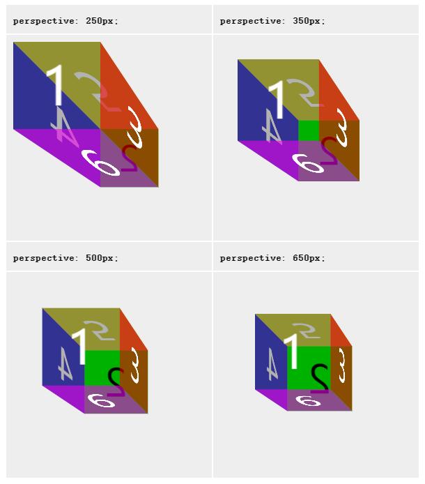
//下面的 HTML 创建了同一个立方体的四个副本,perspective 设置为不同的值。
HTML

<table>
  <tbody>
    <tr>
      <th><code>perspective: 250px;</code>
      </th>
      <th><code>perspective: 350px;</code>
      </th>
    </tr>
    <tr>
      <td>
        <div class="container">
          <div class="cube pers250">
            <div class="face front">1</div>
            <div class="face back">2</div>
            <div class="face right">3</div>
            <div class="face left">4</div>
            <div class="face top">5</div>
            <div class="face bottom">6</div>
          </div>
        </div>
      </td>
      <td>
        <div class="container">
          <div class="cube pers350">
            <div class="face front">1</div>
            <div class="face back">2</div>
            <div class="face right">3</div>
            <div class="face left">4</div>
            <div class="face top">5</div>
            <div class="face bottom">6</div>
          </div>
        </div>
      </td>
    </tr>
    <tr>
      <th><code>perspective: 500px;</code>
      </th>
      <th><code>perspective: 650px;</code>
      </th>
    </tr>
    <tr>
      <td>
        <div class="container">
          <div class="cube pers500">
            <div class="face front">1</div>
            <div class="face back">2</div>
            <div class="face right">3</div>
            <div class="face left">4</div>
            <div class="face top">5</div>
            <div class="face bottom">6</div>
          </div>
        </div>
      </td>
      <td>
        <div class="container">
          <div class="cube pers650">
            <div class="face front">1</div>
            <div class="face back">2</div>
            <div class="face right">3</div>
            <div class="face left">4</div>
            <div class="face top">5</div>
            <div class="face bottom">6</div>
          </div>
        </div>
      </td>
    </tr>
  </tbody>
</table>


//CSS 建立了不同透视距离的 class,还包括容器盒、立方体本身以及它的每个面的 class。
CSS

/* shorthand classes for different perspective values */
.pers250 {
  perspective: 250px;
}

.pers350 {
  perspective: 350px;
}

.pers500 {
  perspective: 500px;
}

.pers650 {
  perspective: 650px;
}

/* define the container div, the cube div, and a generic face */
.container {
  width: 200px;
  height: 200px;
  margin: 75px 0 0 75px;
  border: none;
}

.cube {
  width: 100%;
  height: 100%;
  backface-visibility: visible;
  perspective-origin: 150% 150%;
  transform-style: preserve-3d;
}

.face {
  display: block;
  position: absolute;
  width: 100px;
  height: 100px;
  border: none;
  line-height: 100px;
  font-family: sans-serif;
  font-size: 60px;
  color: white;
  text-align: center;
}

/* define each face based on direction */
.front {
  background: rgba(0, 0, 0, 0.3);
  transform: translatez(50px);
}

.back {
  background: rgba(0, 255, 0, 1);
  color: black;
  transform: rotatey(180deg) translatez(50px);
}

.right {
  background: rgba(196, 0, 0, 0.7);
  transform: rotatey(90deg) translatez(50px);
}

.left {
  background: rgba(0, 0, 196, 0.7);
  transform: rotatey(-90deg) translatez(50px);
}

.top {
  background: rgba(196, 196, 0, 0.7);
  transform: rotatex(90deg) translatez(50px);
}

.bottom {
  background: rgba(196, 0, 196, 0.7);
  transform: rotatex(-90deg) translatez(50px);
}

/* make the table a little nicer */
th, p, td {
  background-color: #eeeeee;
  padding: 10px;
  font-family: sans-serif;
  text-align: left;
}