backface-visibility
版本:CSS3
CSS 属性 backface-visibility 指定当元素背面朝向观察者时是否可见。
示例
/* keyword values */
backface-visibility: visible;
backface-visibility: hidden;

/* global values */
backface-visibility: inherit;
backface-visibility: initial;
backface-visibility: unset;
浏览器支持
 |  |  |  |  |
IE10以上版本的浏览器都支持backface-visibility | ||||
语法
backface-visibility :visible| hidden
取值:
- visible:背面朝向用户时可见。
- hidden:背面朝向用户时不可见。
说明:
指定元素背面面向用户时是否可见。
- 决定一个元素背面面向用户时是否可见,需要直接在该元素上定义
backface-visibility属性,而不能在其父元素上,因为该属性默认为不可继承。 - 对应的脚本特性为backfaceVisibility。
这是一个实验中的功能
此功能某些浏览器尚在开发中,请参考浏览器兼容性表格以得到在不同浏览器中适合使用的前缀。由于该功能对应的标准文档可能被重新修订,所以在未来版本的浏览器中该功能的语法和行为可能随之改变。
| 默认值 | visible |
| 适用于 | 变换元素 |
| 继承性 | 无 |
| 动画性 | 否 |
| 计算值 | 指定值 |
举例
//HTML

<table>
  <tr>
    <th><code>backface-visibility: visible;</code></th>
    <th><code>backface-visibility: hidden;</code></th>
  </tr>
  <tr>
    <td>
      <div class="container">
        <div class="cube showbf">
          <div class="face front">1</div>
          <div class="face back">2</div>
          <div class="face right">3</div>
          <div class="face left">4</div>
          <div class="face top">5</div>
          <div class="face bottom">6</div>
        </div>
      </div>
      <p>
        since all faces are partially transparent,
        the back faces (2, 4, 5) are visible
        through the front faces (1, 3, 6).
      </p>
    </td>
    <td>
      <div class="container">
        <div class="cube hidebf">
          <div class="face front">1</div>
          <div class="face back">2</div>
          <div class="face right">3</div>
          <div class="face left">4</div>
          <div class="face top">5</div>
          <div class="face bottom">6</div>
        </div>
      </div>
      <p>
        the three back faces (2, 4, 5) are
        hidden.
      </p>
    </td>
  </tr>
</table>

//CSS

/* classes that will show or hide the
   three back faces of the "cube" */
.showbf div {
  backface-visibility: visible;
}

.hidebf div {
  backface-visibility: hidden;
}

/* define the container div, the cube div, and a generic face */
.container {
  width: 150px;
  height: 150px;
  margin: 75px 0 0 75px;
  border: none;
}

.cube {
  width: 100%;
  height: 100%;
  perspective: 550px;
  perspective-origin: 150% 150%;
  transform-style: preserve-3d;
}

.face {
  display: block;
  position: absolute;
  width: 100px;
  height: 100px;
  border: none;
  line-height: 100px;
  font-family: sans-serif;
  font-size: 60px;
  color: white;
  text-align: center;
}

/* define each face based on direction */
.front {
  background: rgba(0, 0, 0, 0.3);
  transform: translatez(50px);
}

.back {
  background: rgba(0, 255, 0, 1);
  color: black;
  transform: rotatey(180deg) translatez(50px);
}

.right {
  background: rgba(196, 0, 0, 0.7);
  transform: rotatey(90deg) translatez(50px);
}

.left {
  background: rgba(0, 0, 196, 0.7);
  transform: rotatey(-90deg) translatez(50px);
}

.top {
  background: rgba(196, 196, 0, 0.7);
  transform: rotatex(90deg) translatez(50px);
}

.bottom {
  background: rgba(196, 0, 196, 0.7);
  transform: rotatex(-90deg) translatez(50px);
}

/* make the table a little nicer */
th, p, td {
  background-color: #eeeeee;
  margin: 0px;
  padding: 6px;
  font-family: sans-serif;
  text-align: left;
}
backface-visibility: visible; | backface-visibility: hidden; |
|---|---|
1 2 3 4 5 6 Since all faces are partially transparent, the back faces(2, 4, 5)are visible through the front faces(1, 3, 6). | The three back faces(2, 4, 5)are hidden. |
div
{
position:relative;
	height:100px;
	width:100px;
	text-align:center;
	line-height:100px;
	background-color:pink;
	transform:rotatey(180deg);
	-webkit-transform:rotatey(180deg);/*chromeandsafari*/
	-moz-transform:rotatey(180deg);/*firefox*/
}
#div1
{
	-webkit-backface-visibility:hidden;
	-moz-backface-visibility:hidden;
	-ms-backface-visibility:hidden;
}
#div2
{
	-webkit-backface-visibility:visible;
	-moz-backface-visibility:visible;
	-ms-backface-visibility:visible;
}
</style>
</head>
<body>
<div id="div1">盒一</div>
<div id="div2">盒二</div>
效果图:
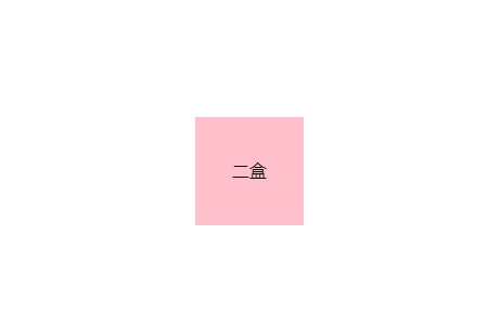
在上面的案例中设置盒一的背面是不可见的,所以当它旋转180度就会消失;而盒二设置的背面可见因此旋转180度后仍然可见