插槽 slot
插槽内容和出口
我们已经了解到,子组件可以接受 props,来接受父组件传递数据,它可以是任何类型的 JavaScript 值。
但是模板内容呢?在某些情况下,我们可能希望把模板片段传递给子组件,并让子组件在其自己的模板中渲染该片段。
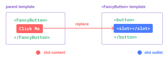
例如,我们可能有一个支持这样使用的<FancyButton>组件:
<-- 父组件 -->
<FancyButton>
  Click me! <!-- slot 内容 -->
</FancyButton>
<FancyButton>模板,如下所示:
<-- 子组件 -->
<button class="fancy-btn">
  <slot></slot> <!-- slot 出口 -->
</button>
该<slot>元素是一个插槽出口,指示应在何处呈现父级提供的插槽内容。
最后渲染的 DOM:
<button class="fancy-btn">
  Click me!
</button>
通过使用插槽,<FancyButton>仅负责渲染<button>外层(以及相应的样式),而其内部的内容由父组件提供,由<slot>对应位置的父组件<FancyButton>内容提供。
另一种,理解slot的方法: JavaScript 函数:
// parent component passing slot content
FancyButton('Click me!')

// FancyButton renders slot content in its own template
function FancyButton(slotContent) {
  return (
    `<button class="fancy-btn">
      ${slotContent}
    </button>`
  )
}
slot内容不仅仅可以是文本,还可以是任何有效的模板内容,甚至是其他组件。还可以有多个元素:
<-- 父组件 -->
<FancyButton>
  <span style="color:red">Click me!</span>
  <AwesomeIcon name="plus" />
</FancyButton>
通过使用slot,<FancyButton>可以灵活和可重用。我们可以在不同的地方使用它,具有不同的内部内容,但都具有相同的精美样式。
Vue 组件的插槽机制受到原生 Web 组件<slot>元素的启发,但具有的其他功能,我们稍后会看到。
渲染作用域
在父组件中的slot插槽内容,可以访问父组件的数据范围,因为它是在父组件的模板中定义的。例如:
<span>{{ message }}</span>
<FancyButton>{{ message }}</FancyButton>
在这里,两个{{message}}插值都将呈现相同的内容。
在父组件中的slot插槽内容无权访问子组件的数据。Vue 模板中的表达式只能访问其定义时所处的作用域,这和 JavaScript 的词法作用域规则是一致的。换言之::父组件模板中的表达式只能访问父组件的作用域;子组件模板中的表达式只能访问子组件的作用域。
默认内容
为一个插槽指定默认内容,是很有用的。在外部没有提供任何内容的情况下,它会被渲染。例如,在一个<SubmitButton>组件中:
父级
<SubmitButton></SubmitButton>
子级 <button type="submit"><slot></slot> </button>
如果<button>父级没有提供任何插槽内容,在<button>内渲染出来Submit。,只需要将Submit写在<slot>标签之间来作为默认内容:
子级 <button type="submit"><slot> Submit <!-- 默认内容 --><slot> </button>
渲染后呈现
<button type="submit">Submit</button>
但如果我们提供内容:
父级
<SubmitButton>Save</SubmitButton>
子级 <button type="submit"><slot> Submit<slot> </button>
渲染后呈现
<button type="submit">Save</button>
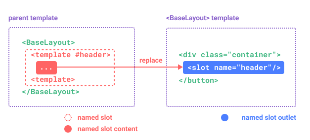
具名插槽
有时,在一个组件中,包含多个插槽出口是很有用的。例如,在<BaseLayout>的组件中,具有以下模板
子级
<div class="container">
  <header>
    <!-- 标题内容放这里 -->
  </header>
  <main>
    <!-- 主要内容放这里 -->
  </main>
  <footer>
    <!-- 底部内容放这里 -->
  </footer>
</div>
对于这些情况,<slot>元素有一个特殊的属性name,它可以用来为不同的插槽分配一个唯一ID,这样你就可以确定应该在哪里呈现内容:
子级
<div class="container">
  <header>
    <slot name="header"></slot>
  </header>
  <main>
    <slot></slot>
  </main>
  <footer>
    <slot name="footer"></slot>
  </footer>
</div>
这类带name的插槽,被称为具名插槽(named slots)。没有提供name的<slot>出口会隐式地具名为name:default。
在父组件中,使用<BaseLayout>时,我们需要一种方式,将多个插槽内容,传入到各自目标插槽的出口。此时就需要用到具名插槽。要为具名插槽传入内容,我们需要使用一个含v-slot指令的<template>元素,并将目标插槽的名字传给该v-slot指令:
父级 <BaseLayout><template v-slot:header> <!-- header 插槽的内容放这里 --></template> </BaseLayout>
v-slot有专门的缩写#。
<template v-slot:header>简写为:<template #header>
其意思就是“将这部分模板片段传入子组件的 header 插槽中”。
使用缩写语法的代码:
父级 <BaseLayout><template #header><h1>Here might be a page title</h1></template>默认槽<template #default><p>A paragraph for the main content.</p> <p>And another one.</p></template><template #footer><p>Here's some contact info</p></template></BaseLayout>
默认槽:不带名称的插槽,或者名称是 default。具名槽:具备独立名称的槽。
当组件同时接受默认槽和具名槽时,所有位于顶级的非<template>节点,都被隐式视为,默认插槽的内容。所以上面也可以写成:
父级
<BaseLayout>
  <template #header>
    <h1>Here might be a page title</h1>
  </template>

  <!-- 隐式的默认插槽 -->
  <p>A paragraph for the main content.</p>
  <p>And another one.</p>

  <template #footer>
    <p>Here's some contact info</p>
  </template>
</BaseLayout>
现在<template>元素内的所有内容都将传递到相应的插槽。最终呈现的 HTML 将是:
子级
<div class="container">
  <header>
    <h1>Here might be a page title</h1>
  </header>
  <main>
    <p>A paragraph for the main content.</p>
    <p>And another one.</p>
  </main>
  <footer>
    <p>Here's some contact info</p>
  </footer>
</div>
同样,它可以帮助您使用 JavaScript 函数类比更好地理解具名插槽:
// passing multiple slot fragments with different names
BaseLayout({
  header: `...`,
  default: `...`,
  footer: `...`
})

// <BaseLayout> renders them in different places
function BaseLayout(slots) {
  return (
    `<div class="container">
      <header>${slots.header}</header>
      <main>${slots.default}</main>
      <footer>${slots.footer}</footer>
    </div>`
  )
}
动态插槽名称
动态指令参数在v-slot上也是有效的,即可以定义下面这样的动态插槽名:
父级
<base-layout>
  <template v-slot:[dynamicSlotName]>
    ...
  </template>

  <!-- 简写 -->
  <template #[dynamicSlotName]>
    ...
  </template>
</base-layout>
注意:这里的表达式和动态指令参数受相同的语法限制(指令参数语法限制)。
作用域插槽
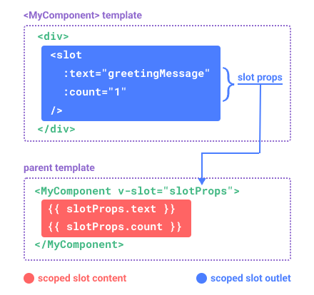
在上面的渲染作用域中我们讨论到,插槽的内容无法访问到子组件的状态。但是,在某些情况下,如果想要实现插槽的内容可以,同时使用父组件域内和子组件域内的数据。要做到这一点,我们需要一种方法来让子组件在渲染时将一部分数据提供给插槽。事实上,我们完全可以这样做!可以像对组件传递prop那样,向一个插槽的插口上传递 attribute:
子级中的模板代码
<!-- <MyComponent> template -->
<div>
  <slot :text="greetingMessage" :count="1"></slot>
</div>
当需要接收插槽props时,默认插槽和具名插槽的使用方式有点不同。
默认作用域插槽
下面我们将先展示默认插槽如何接受props。父级组件的模板中,通过子组件标签上的v-slot指令,直接接收到了一个插槽props对象:
父级组件模板中,设置子组件标签
<MyComponent v-slot="slotProps">
  {{ slotProps.text }} {{ slotProps.count }}
</MyComponent>
子组件传入插槽的props,可以作为相应v-slot指令的值使用,可以在插槽内的表达式中访问。
您可以将作用域插槽视为传递给子组件的函数。然后子组件调用它并将属性props作为参数传递:
MyComponent({
  // passing the default slot, but as a function
  default: (slotProps) => {
    return `${slotProps.text} ${slotProps.count}`
  }
})

function MyComponent(slots) {
  const greetingMessage = 'hello'
  return (
    `<div>${
      // call the slot function with props!
      slots.default({ text: greetingMessage, count: 1 })
    }</div>`
  )
}
实际上,这已经和作用域插槽的最终代码编译结果、以及手动编写渲染函数时使用作用域插槽的方式非常类似了。
v-slot="slotProps"函数签名,和函数的参数类似,我们也可以在v-slot内使用解构赋值:
<MyComponent v-slot="{ text, count }">
  {{ text }} {{ count }}
</MyComponent>
具名作用域插槽
具名作用域插槽的工作方式也是类似的,插槽props可作为v-slot指令的值被访问:v-slot:name="slotProps"。使用缩写时,它看起来像这样:
父级模板中代码
<MyComponent>
  <template #header="headerProps">
    {{ headerProps }}
  </template>

  <template #default="defaultProps">
    {{ defaultProps }}
  </template>

  <template #footer="footerProps">
    {{ footerProps }}
  </template>
</MyComponent>
向具名插槽中传入props:
子级模板中代码 <slot name="header"message ="hello"></slot>
注意:插槽上的name是由 Vue 保留的,不会作为props传递给插槽。因此最终headerProps的结果是{message:'hello'}。
具名作用域插槽 vs 默认作用域插槽
如果你混用了具名插槽与默认插槽,则需要为默认插槽使用显式的<template>标签。尝试直接为组件添加v-slot指令将导致编译错误。这是为了避免因默认插槽的props的作用域而困惑。举例:
<!-- 该模板无法编译 -->
<template>
  <MyComponent v-slot="{ message }">
    <p>{{ message }}</p>
    <template #footer>
      <!-- message 属于默认插槽,此处不可用 -->
      <p>{{ message }}</p>
    </template>
  </MyComponent>
</template>
为默认插槽使用显式的<template>标签有助于更清晰地指出message属性在其它插槽中不可用:
<template>
  <MyComponent>
    <!-- 使用显式的默认插槽 -->
    <template #default="{ message }">
      <p>{{ message }}</p>
    </template>

    <template #footer>
      <p>Here's some contact info</p>
    </template>
  </MyComponent>
</template>
高级列表组件示例
你可能想问什么样的场景才适合用到作用域插槽,这里我们来看一个<FancyList>组件的例子,它会渲染一个列表,其中会封装一些加载远端数据的逻辑、以及使用此数据来做列表渲染,或者是像分页、无限滚动这样更进阶的功能。然而我们希望它能够灵活处理每一项的外观,并将对每一项样式的控制权留给使用它的父组件。我们期望的用法可能是这样的:
父级模板中代码 <FancyList :api-url="url" :per-page="10"><template#item="{ body, username, likes }"> <div class="item"> <p>{{ body }}</p> <p>by {{ username }} | {{ likes }} likes</p> </div></template></FancyList>
在<FancyList>内部,我们可以使用相同的slot,多次渲染不同的项目数据。注意:我们使用v-bind传递插槽props:
子级模板中代码 <ul> <liv-for ="itemin items"> <slotname ="item"v-bind ="item"></slot> </li> </ul>
无渲染组件
我们上面讨论的<FancyList>用例封装了可重用逻辑(数据获取、分页等)和视觉输出,同时通过作用域插槽将部分视觉输出委托给消费者组件。
如果我们将这个概念拓展一下,可以想象的是,一些组件可能只包括了逻辑而不需要自己渲染内容,视图输出通过作用域插槽全权交给了消费者组件。我们称这种类型的组件为无渲染组件。
这里有一个无渲染组件的例子,一个封装了追踪当前鼠标位置逻辑的组件:
<MouseTracker v-slot="{ x, y }">
  Mouse is at: {{ x }}, {{ y }}
</MouseTracker>
虽然这个模式很有趣,但大部分能用无渲染组件实现的功能都可以通过组合式 API 以另一种更高效的方式实现,并且还不会带来额外组件嵌套的开销。
尽管如此,作用域插槽在需要同时封装逻辑、组合视图界面时还是很有用。就像上面的<FancyList>组件那样。