border-bottom-right-radius
版本:CSS3
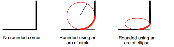
border-bottom-right-radius属性设置元素的右下角弧形,这个圆弧可能是一个椭圆,或者其中一个值是0的话,就是没有圆弧,换句话就是说拐角是方形的。
盒模型的背景,可以是一张图片或一种颜色,会在边框处被剪裁,更甚至可以是一个圆;剪切的额外定位通过另一个CSS属性background-clip来定义。
在border-bottom-right-radius属性值之后,如果作用的元素上没有设置border-radius属性,那么这个属性值就会通过简写属性重新设置成它的初始值。
示例
/* the corner is a circle */
/* border-bottom-right-radius: radius */
border-bottom-right-radius: 3px;

/* the corner is an ellipsis */
/* border-bottom-right-radius: horizontal vertical */
border-bottom-right-radius: 0.5em 1em;

border-bottom-right-radius: inherit;
浏览器支持
 |  |  |  |  |
IE9以上版本的浏览器都支持border-bottom-right-radius | ||||
语法
border-bottom-right-radius :<length>| <percentage>
- 若一个值:表示右下角边框的圆角半径。
- 若两个值:第一个值表示右下角的椭圆的水平半径。第二个值表示右下角的椭圆的垂直半径。
取值:
- 如设置
border-bottom-right-radius:5px 10px表示top-right这个角的水平圆角半径为5px,垂直圆角半径为10px。 - 对应的脚本特性为borderTopRightRadius。
| 默认值 | 0 |
| 适用于 | 所有元素 |
| 继承性 | 无 |
| 动画性 | 是 |
| 计算值 | 指定值 |
实例
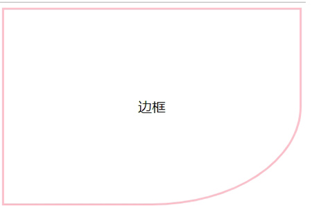
<!DOCTYPE html>
<html>
<head>
<style>
div{
	width:430px;
	height:300px;
	border:3pxsolidpink;
	border-bottom-right-radius:50%;
	text-align:center;
	line-height:300px;
	font-size:20px;

}
</style>
</head>
<body>
<div>边框</div>
</body>
</html>
效果图:
| Live example | Code |
|---|---|
An arc of circle is used as the border
div {
  border-bottom-right-radius: 40px 40px;
}
| |
An arc of ellipse is used as the border
div {
  border-bottom-right-radius: 40px 20px;
}
| |
The box is a square: an arc of circle is used as the border
div {
  border-bottom-right-radius: 40%;
}
| |
The box is not a square: an arc of ellipse is used as the border
div {
  border-bottom-right-radius: 40%;
}
| |
The background color is clipped at the border
div {
  border-bottom-right-radius:40%;
  border-style: black 3px double;
  background-color: rgb(250,20,70);
  background-clip: content-box;
}
|