flex-grow
版本:CSS3
CSS属性flex-direction值。
剩余空间的大小等于flex 容器的大小减去所有 flex 项的大小之和。
如果所有的兄弟项目都有相同的flex-grow系数,那么所有的项目将获得相同的剩余空间,否则将根据不同的flex-grow系数定义的比例进行分配。flex-grow与其他的 flex 属性flex-shrink和flex-basis一起使用,通常使用flex速记来定义,以确保所有的值都被设置。
示例
/* <number> values */
flex-grow: 3;
flex-grow: 0.6;

/* 全局 values */
flex-grow: inherit;
flex-grow: initial;
flex-grow: unset;
浏览器支持
 |  |  |  |  |
IE11 以上版本的浏览器都支持flex-grow | ||||
| 默认值 | 0 |
| 适用于 | flex 项,包括 in-flow 伪元素 |
| 继承性 | 无 |
| 动画性 | visual |
| 计算值 | 指定值 |
语法
flex-grow :<number>
取值
<number>:参见<number>。负值无效,默认为0。
说明:
设置或检索弹性盒的扩展比率。
- 根据弹性盒子元素所设置的扩展因子(即
flex-basis)作为比率来分配剩余空间。 flex-grow的默认值为0,如果没有显示定义该属性,是不会拥有分配剩余空间权利的。- 对应的脚本特性为flexGrow。
实例
把 b、c 项按照 1:3 的比率分配剩余空间
<style>
.flex { display: flex; width: 600px; margin: 0; padding: 0; list-style: none; }
.flex li:nth-child(1) { width: 200px; }
.flex li:nth-child(2) { width: 50px; flex-grow: 1; }
.flex li:nth-child(3) { width: 50px; flex-grow: 3; }
</style>

<ul style="flex">
    <li>a</li>
    <li>b</li>
    <li>c</li>
</ul>
本例中 flex 容器的剩余空间长度为:600 - 200 - 50 - 50 = 300px,b、c 两项都显式的定义了flex-grow,flex 容器的剩余空间分成了 4 份,其中 b 占 1 份,c 占 3 份,即 1:3。所以最终 a、b、c的长度分别为:
- a 长度:200px
- b 长度:50 +((1/4)* 300)= 125px
- c 长度:50 +((3/4)* 300)= 275px
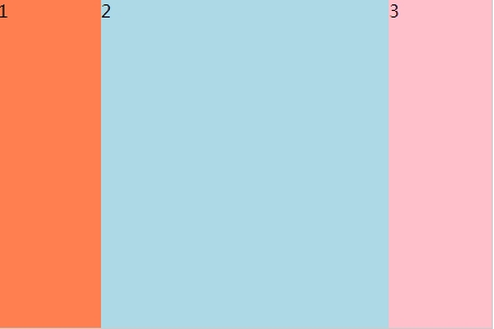
<style>
#main{
    width:450px;
    height:300px;
    border:1px solid #ccc;
    display:-webkit-flex;
    display:flex;
}

#main div:nth-of-type(1) { flex-grow: 1; }
#main div:nth-of-type(2) { flex-grow: 3; }
#main div:nth-of-type(3) { flex-grow: 1; }
</style>

<div id="main">
    <div>1</div>
    <div>2</div>
    <div>3</div>
</div>
效果图: