flex-direction
版本:CSS3
CSS flex-direction属性指定了内部元素是如何在 flex 容器中布局的,定义了主轴的方向(正方向或反方向)。
示例
/* the direction text is laid out in a line */
flex-direction: row;

/* like <row>, but reversed */
flex-direction: row-reverse;

/* the direction in which lines of text are stacked */
flex-direction: column;

/* like <column>, but reversed */
flex-direction: column-reverse;

/* global values */
flex-direction: inherit;
flex-direction: initial;
flex-direction: unset;
浏览器支持
 |  |  |  |  |
IE11以上版本的浏览器都支持flex-direction | ||||
语法
flex-direction :row | row-reverse | column | column-reverse
取值
- row:flex容器的主轴被定义为与文本方向相同。主轴起点和主轴终点与内容方向相同。
- row-reverse:表现和row相同,但是置换了主轴起点和主轴终点。
- column:flex容器的主轴和块轴相同。主轴起点与主轴终点和书写模式的前后点相同。
- column-reverse:表现和column相同,但是置换了主轴起点和主轴终点。
说明:
该属性通过定义flex容器的主轴方向来决定felx子项在flex容器中的位置。这将决定flex需要如何进行排列
- 该属性的反转取值不影响元素的绘制,语音和导航顺序,只改变流动方向。这与
<writing-mode>和<direction>相同。 - 对应的脚本特性为flexDirection。
- 注意,值
row和row-reverse受 flex 容器的方向性的影响。如果它的 dir 属性是 ltr,row 表示从左到右定向的水平轴,而 row-reverse 表示从右到左;如果 dir 属性是 rtl,row 表示从右到左定向的轴,而 row-reverse 表示从左到右。
| 默认值 | row |
| 适用于 | flex 容器 |
| 继承性 | 无 |
| 动画性 | visual |
| 计算值 | 指定值 |
例子
将一个容器内的子元素反转横向排列
<ul>
<li>a</li>
<li>b</li>
<li>c</li>
</ul>
#box{
display: flex;
flex-direction: row ;
list-style: none;
}
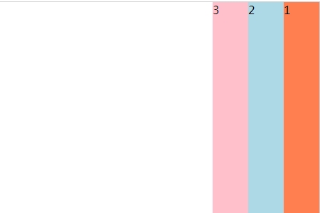
//HTML
<div id="main">
<div>1</div>
<div>2</div>
<div>3</div>
</div>
//CSS
#main{
width:450px;
height:300px;
border:1px solid #ccc;
display:-webkit-flex;
display:flex;
flex-direction:row-reverse ;
-webkit-flex-direction:row-reverse;
}
#main div{
width:50px;
}
效果图: