align-self
版本:CSS3
CSS属性align-self会对齐当前 flex 行中的 flex 元素,并覆盖已有的align-self。在网格布局中,它将项目与网格区域内的项目对齐。在 Flexbox中会按照cross axis(当前flex 元素排列方向的垂直方向)进行排列。
示例
/* Keyword values */
align-self: auto;
align-self: normal;

/* Positional alignment */
/* align-self does not take left and right values */
align-self: center; /* Put the item around the center */
align-self: start;  /* Put the item at the start */
align-self: end;    /* Put the item at the end */
align-self: self-start; /* Align the item flush at the start */
align-self: self-end;   /* Align the item flush at the end */
align-self: flex-start; /* Put the flex item at the start */
align-self: flex-end;   /* Put the flex item at the end */

/* Baseline alignment */
align-self: baseline;
align-self: first baseline;
align-self: last baseline;
align-self: stretch; /* Stretch 'auto'-sized items to fit the container */

/* Overflow alignment */
align-self: safe center;
align-self: unsafe center;

/* Global values */
align-self: inherit;
align-self: initial;
align-self: unset;
浏览器支持
 |  |  |  |  |
IE11以上版本的浏览器都支持align-self | ||||
语法
align-self :auto| normal | stretch |<baseline-position>|<overflow-position>?<self-position>
<baseline-position>=[ first | last ]? baseline
<overflow-position>= unsafe | safe
<self-position>= center | start | end | self-start | self-end | flex-start | flex-end
取值
- auto:默认值。元素继承了它的父容器的align-items属性。如果没有父容器则为"stretch"。
- normal:效果取决于当前的布局模式:
- 绝对定位布局中,normal在绝对定位的替代元素上表现为start,在所有其他绝对定位元素上表现为stretch。
- 在绝对定位的静态元素上表现为stretch。
- flex布局中表现为stretch。
- For grid items, this keyword leads to a behavior similar to the one of stretch, except for boxes with an aspect ratio or an intrinsic sizes where it behaves like start.
- 在块级和表格单元中无效。
- self-start:Aligns the items to be flush with the edge of the alignment container corresponding to the item's start side in the cross axis.
- self-end:Aligns the items to be flush with the edge of the alignment container corresponding to the item's end side in the cross axis.
- flex-start:flex 元素会对齐到 cross-axis 的首端。
- flex-end:flex 元素会对齐到 cross-axis 的尾端。
- center:flex 元素会对齐到 cross-axis 的中间,如果该元素的 cross-size 尺寸大于 flex 容器,将在两个方向均等溢出。
- baseline、first baseline、last baseline:Specifies participation in first- or last-baseline alignment: aligns the alignment baseline of the box’s first or last baseline set with the corresponding baseline in the shared first or last baseline set of all the boxes in its baseline-sharing group.The fallback alignment for first baseline is start, the one for last baseline is end.
flex 元素将会基于容器的宽和高,按照自身 margin box 的 cross-size 拉伸。If the combined size of the items along the cross axis is less than the size of the alignment container and the item is auto-sized, its size is increased equally(not proportionally), while still respecting the constraints imposed by max-height/max-width(or equivalent functionality), so that the combined size of all auto-sized items exactly fills the alignment container along the cross axis. - safe:If the size of the item overflows the alignment container, the item is instead aligned as if the alignment mode were start.
- unsafe:Regardless of the relative sizes of the item and alignment container, the given alignment value is honored.
| 默认值 | auto |
| 适用于 | 多行的弹性盒模型容器 |
| 继承性 | 无 |
| 动画性 | visual |
| 计算值 | 指定值 |
align-self取值
.main .demo{
    align-self:auto;
}
效果图: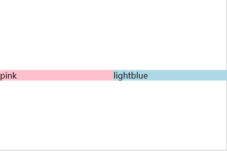
stretch:元素被拉伸以适应容器。如果指定侧轴大小的属性值为'auto',则其值会使项目的边距盒的尺寸尽可能接近所在行的尺寸,但同时会遵照'min/max-width/height'属性的限制。
.main .demo{
    align-self:stretch;
}
效果图: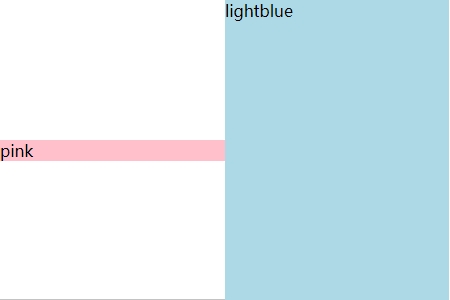
center:元素位于容器的中心。。弹性盒子元素在该行的侧轴(纵轴)上居中放置。(如果该行的尺寸小于弹性盒子元素的尺寸,则会向两个方向溢出相同的长度)。
.main .demo{
    align-self:center;
}
效果图: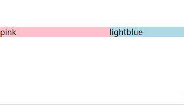
flex-start:元素位于容器的开头。弹性盒子元素的侧轴(纵轴)起始位置的边界紧靠住该行的侧轴起始边界。
.main .demo{
    align-self:flex-start;
}
效果图: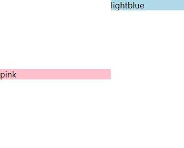
flex-end:元素位于容器的结尾。弹性盒子元素的侧轴(纵轴)起始位置的边界紧靠住该行的侧轴结束边界。
.main .demo{
    align-self:flex-end;
}
效果图:
baseline :元素位于容器的基线上。如弹性盒子元素的行内轴与侧轴为同一条,则该值与'flex-start'等效。其它情况下,该值将参与基线对齐。
.main .demo{
    align-self:baseline;
}
效果图:
section {
display: flex;
align-items: center ;
height: 120px;
background: beige;
}
div {
height: 60px;
background: cyan;
margin: 5px;
}
div:nth-child(3) {
align-self: flex-end ;
background: pink;
}
<section>
<div>Item #1</div>
<div>Item #2</div>
<div>Item #3</div>
</section>
Item #1
Item #2
Item #3