border-image
版本:CSS3
border-image CSS属性允许在元素的边框上绘制图像。这使得绘制复杂的外观组件更加简单,也不用在某些情况下使用九宫格了。使用border-image时,其将会替换掉border-style属性所设置的边框样式。虽然规范要求使用border-image时边框样式必须存在,但一些浏览器可能没有实现这一点。特别注意,若border-image-source:none或者图片不能显示,则将应用border-style。
示例
/* border-image: image-source image-height image-width image-repeat */
border-image: url("/upload/browser/compatible_chrome.gif") 30 30 repeat;
border-image: url("/upload/browser/compatible_ie.gif") 30 30 stretch;
浏览器支持
 |  |  |  |  |
IE11以上版本的浏览器都支持border-image | ||||
语法
border-image :<border-image-source>||<border-image-slice>[ /<border-image-width>| /<border-image-width>? /<border-image-outset>]?||<border-image-repeat>
取值
- <border-image-source>:设置或检索对象的边框是否用图像定义样式或图像来源路径。参见
border-image-source - <border-image-slice>:设置或检索对象的边框背景图的分割方式。参见
border-image-slice - <border-image-width>:设置或检索对象的边框厚度。参见
border-image-width - <border-image-outset>:设置或检索对象的边框背景图的扩展。参见
border-image-outset - <border-image-repeat>:设置或检索对象的边框图像的平铺方式。参见
border-image-repeat
| 初始值 |
|
| 适用于 | 所有元素,也适用于::first-letter |
| 继承性 | 无 |
| 动画性 | 否 |
| 计算值 | 指定值 |
例子
<div id="bitmap">the image is stretched to fill the area.</div>

//CSS

#bitmap {
  border: 30px solid transparent;
  padding: 20px;
  border-image: url("border.png") 30;
}
渐变
<div id="gradient">the image is stretched to fill the area.</div>

//CSS
#gradient {
  border: 30px solid;
  border-image: linear-gradient(red, yellow) 10;
  padding: 20px;
}
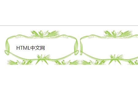
the image is stretched to fill the area.
<!DOCTYPE html>
<html>
<head>
<meta charset="utf-8">
<style>
	p{
	border:15pxsolid;
	padding:30px;
	border-image:url(images/kuang.jpg)42round;
	-webkit-border-image:url(images/kuang.jpg)42round;
	-moz-border-image:url(images/kuang.jpg)42round;
	}
</style>
</head>
<body>
<p>CSS教程</p>
</body>
</html>
效果图: