gap
版本:CSS3
CSS属性 gap 是用来设置网格行与列之间的间隙(gutters),该属性是row-gap and column-gap的简写形式。
示例
/* Onevalue */ gap: 20px; gap: 1em; gap: 3vmin; gap: 0.5cm; /* One value */ gap: 16%; gap: 100%; /* Two values */ gap: 20px 10px; gap: 1em 0.5em; gap: 3vmin 2vmax; gap: 0.5cm 2mm; /* One or two values */ gap: 16% 100%; gap: 21px 82%; /* calc() values */ gap: calc(10% + 20px); gap: calc(20px + 10%) calc(10% - 5px); /* Global values */ gap: inherit; gap: initial; gap: unset;
浏览器支持
 |  |  |  |  |
在网格布局中,IE不支持gap,其余浏览器都支持gap | ||||
在多列布局中,IE不支持gap,其余浏览器都支持gap | ||||
在Flex 布局中,只有火狐浏览器都支持gap | ||||
语法
gap :<row-gap><column-gap>
- 该属性用来表示<row-gap>和<column-gap>的值,而<column-gap>是可选的,假如<column-gap>缺失的话,则会被设置成跟<row-gap>一样的的值。
- <row-gap> and<column-gap>都可以用
<length>或者<percentage>来表示。
取值
- <length>:网格线之间的间隙宽度。
- <percentage>:网格线直接的间隙宽度,相对网格容器的百分比。
实例
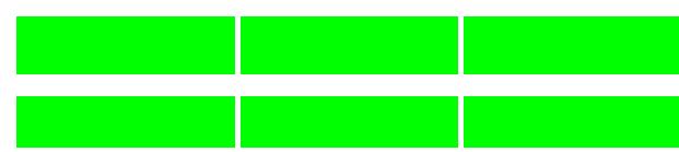
Flex布局
这是一个实验中的功能。此功能某些浏览器尚在开发中,请参考浏览器兼容性表格以得到在不同浏览器中适合使用的前缀。由于该功能对应的标准文档可能被重新修订,所以在未来版本的浏览器中该功能的语法和行为可能随之改变。
#flexbox {
  display: flex;
  flex-wrap: wrap;
  width: 300px;
  gap: 20px 5px;
}

#flexbox > div {
  border: 1px solid green;
  background-color: lime;
  flex: 1 1 auto;
  width: 100px;
  height: 50px;

}

<div id="flexbox">
  <div></div>
  <div></div>
  <div></div>
  <div></div>
  <div></div>
  <div></div>
</div>
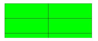
Grid布局
#grid {
  display: grid;
  height: 200px;
  grid-template: repeat(3, 1fr) / repeat(3, 1fr);
  gap: 20px 5px;
}

#grid > div {
  background-color: lime;
}

<div id="grid">
  <div></div>
  <div></div>
  <div></div>
  <div></div>
  <div></div>
  <div></div>
  <div></div>
  <div></div>
  <div></div>
</div>
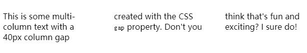
多列布局
.content-box {
  column-count: 3;
  gap: 40px;
}

<p class="content-box">
  This is some multi-column text with a 40px column
  gap created with the CSS <code>gap</code> property.
  Don't you think that's fun and exciting? I sure do!
</p>